Beyond Aesthetics: My Journey Through Powered by Design and the True Purpose of Graphic Design
Written By
Edoardo Francesco Liotta
“Powered by Design” by Renée Stevensis much more than just a graphic design manual. It’s an invitation to reflect on the true meaning of design and the crucial role it plays in problem-solving. Reading this book, I found many concepts that resonate with how I see and live design, but there were also ideas that made me confront some of my deeply held beliefs.
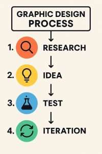
Stevens argues that design isn’t just about aesthetics, it is a process of problem-solving. I couldn’t agree more. Too often, design is reduced to simply choosing two matching colors or using a trendy font, but in reality, there’s so much more behind every well-executed project. For me, design is the result of thorough research on competitors, detailed analysis of personas, and an understanding of current trends. It’s a job that requires study, intuition, and a strategic mindset. And it doesn’t stop there. After the creative phase comes testing, which I consider crucial. That’s when ideas are truly put to the test, and you see whether the project works or if you need to go back to the drawing board. This continuous cycle of research, creation, and validation is the heart of my approach to design.
One specific episode came to mind while reading the book, especially when Stevens talks about the importance of digging deeper into a client’s requests to find the real problem that needs solving. I once lost a client because I tried to do exactly that. I was tasked with creating the entire visual identity and website for his company. As I started my research, I realized that the name he had chosen was already being used by at least eight competitors, not to mention other businesses in unrelated industries with the same or very similar names. I tried to steer him toward more original ideas, something distinctive that would help his company stand out, but he wasn’t interested. In the end, I lost the project, but I walked away knowing I did the right thing. For me, part of being a responsible designer is having the integrity to give honest advice, even when it’s not what the client wants to hear.
Another concept that I deeply connected with in the book is empathy. I believe a good designer must always put themselves in the shoes of the end user. This means looking at the project not just through the eyes of the creative but most importantly through the perspective of the people who will actually use the product or engage with the message. This is also why I try to maintain strong ethical principles in my work and carefully select the clients I collaborate with. Right now, for example, I’m working with BaxEnergy, a company in the renewable energy sector. Collaborating with businesses that are making a positive impact on the world is something that deeply motivates me and aligns with my values.

The topic of accessibility, which Stevens covers extensively, made me reflect even more on my approach. I believe accessibility is crucial, but like many things in design, it depends on the product and context. Often, just a few small adjustments are enough to make a project accessible to a much wider audience. It’s not always necessary to completely overhaul an interface or overcomplicate a design, sometimes it’s the little details that make all the difference. I think every designer should be aware of this and integrate it into their workflow.
One of my favorite aspects of design is typography. Stevens dedicates an entire chapter to this, highlighting how choosing the right font is one of the most powerful tools for conveying emotion and meaning. I totally agree. Typography is the first element that forms a connection between the project and the user. Even before reading the content, people get an immediate sense of tone and identity based on the font chosen. A well-chosen typeface can communicate trust, playfulness, seriousness, or creativity. It’s never a neutral choice, it always carries weight.
Beyond typography, visual hierarchy is, in my opinion, the backbone of any design. Stevens emphasizes this too, and I couldn’t agree more. A clear hierarchy guides the user’s eye, helping them navigate the content and focus on what really matters. Without it, users get lost, not knowing where to look or what to read first. Design should create a visual roadmap that guides the user to the core message. Without it, the risk is that the user gets overwhelmed by the chaos and misses the most important information.
The concept of simplicity is another area where I found myself nodding along while reading. It reminded me of John Maeda and his philosophy on the balance between simplicity and complexity, something I see as a cornerstone of good design. Simple doesn’t mean empty or dull. In fact, achieving simplicity in design is often the result of a meticulous process where unnecessary elements are stripped away, leaving only what’s truly essential. When I’m at that stage in a project, I always ask myself: What’s essential? What’s useful? And what can be eliminated? It’s a process that takes time and careful thought, but in the end, it results in cleaner, clearer, and more effective designs.
One topic that made me pause and reflect was the ethical responsibility of the designer. Stevens stresses the importance of being aware of the impact our work has on society, and I couldn’t agree more. I don’t believe design is ever truly neutral. Every visual choice sends a message and can influence people’s behavior. This is why I carefully choose the projects I take on. I want to work with clients who share my values and whose goals align with positive change. It’s not always easy, but I believe it’s necessary if I want to maintain integrity and work responsibly.

Stevens also delves into the emotional power of design, the idea that a well-executed project can evoke feelings and create deep connections with users. This is something I strive for in my own work. A project shouldn’t just be functional or visually appealing, it should also evoke emotion. That emotional connection is often what makes a design memorable and impactful.
Lastly, the book touches on testing and iteration, an area that completely aligns with my approach. No design is perfect on the first try. It’s an iterative process of trial, error, and refinement. Testing is crucial. It’s when the project meets the real world and you see if your ideas hold up. Sometimes feedback validates your choices, other times, it forces you to rethink everything. But that’s the beauty of design, it’s alive, dynamic, and always evolving.
Conclusion
Reading “Powered by Design”by Renée Stevens felt like embarking on a journey that made me reflect deeply on my work and the principles that guide my approach to design. Many of the concepts she explores align perfectly with how I already work, but there were also new perspectives that challenged me to think differently.
For me, design is a blend of creativity, strategy, and responsibility. It’s not just about making something look good, it’s about solving problems, improving user experiences, and contributing positively to the world.
This book was a great reminder of the importance of staying focused on ethics, accessibility, and the broader impact our work can have. It reaffirmed my belief that design, when done with care and intention, has the power to make a real difference.
If you found this article insightful or have your own experiences to share, let’s continue the conversation!
👉 Join the discussion on LinkedIn or feel free to reach out directly by clicking the buttons below.
