Intellisync: Designing Digital Resilience for Cybersecurity, AI, and Transformation
Written By
Edoardo Francesco Liotta
Some products need to look good. Others need to be trusted — instantly, and without explanation. When a platform touches cybersecurity, AI, and digital transformation at once, the interface isn’t just a layer on top of the product. It’s the first proof that the system behind it is under control.
That was the starting point for Intellisync, a company operating at the intersection of cybersecurity, digital transformation, and artificial intelligence. The goal of this project was to design a single, cohesive experience that could hold all three of those worlds together — without any one of them feeling like an afterthought.
Note: To respect client confidentiality and protect proprietary logic, the visuals and data visualizations shown in this Behance preview have been slightly modified. The core UX architecture remains faithful to the original project.
The Real Challenge: Three Pillars, One Experience
Intellisync’s business isn’t built around a single service — it’s built around three:
- Cybersecurity, protecting client data and infrastructure.
- Digital Transformation, modernizing business processes and legacy systems.
- Artificial Intelligence, giving businesses a predictive, competitive edge.
Each of these pillars has its own logic, its own type of user, and its own idea of what “success” looks like on screen. The challenge wasn’t designing three good dashboards — it was designing one interface where all three could coexist without diluting each other.
The Design Strategy: Future-Proof Logic
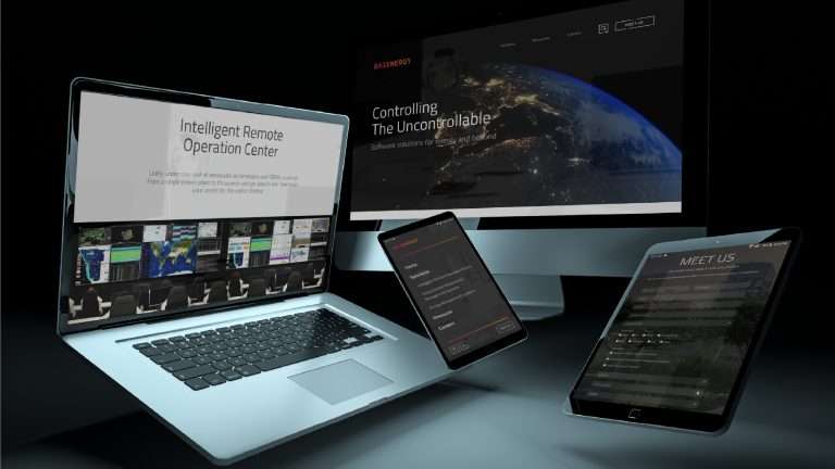
As Senior Designer on this project, the objective was to translate Intellisync’s mission into a high-fidelity interface that communicates two things simultaneously: security and innovation. Those two qualities don’t always sit naturally together — security tends to read as rigid, innovation as fluid — so the visual language had to bridge both without contradicting either.
A “Deep Space” Visual Identity
The interface is built around a dark-themed UI, but this wasn’t a purely aesthetic decision. In cybersecurity and AI-driven products specifically, a dark interface reduces cognitive load over long monitoring sessions and — just as importantly — allows critical alerts and data points to stand out with much higher contrast. In a domain where missing a signal has real consequences, that contrast isn’t decorative. It’s functional.
The Three Core Pillars of the Interface
1. Unyielding Cybersecurity
Security sits at the heart of the Intellisync experience, built around a “Defense by Design” principle. Real-time monitoring dashboards use neural-pattern recognition to flag potential threats before they escalate, rather than simply logging incidents after the fact. The design goal here was speed of comprehension — a threat indicator needed to be understood in under a second, not read like a report.
2. Seamless Digital Transformation
Transformation, by definition, is about movement — and the design had to reflect that. Complex business workflows were streamlined into intuitive, guided navigation paths, so that moving from legacy systems to modern digital tools felt natural rather than disruptive. The intent wasn’t to hide complexity, but to sequence it in a way that never overwhelmed the user mid-transition.
3. Human-Centric AI
AI systems have a reputation problem: they often feel like a black box, even to the people relying on them. The design approach here was the opposite of opacity — making the AI’s actions visible, transparent, and actionable. Instead of abstract outputs, users get clear, predictive data visualizations that explain not just what the AI concluded, but why — giving businesses something they can actually act on with confidence.
The Result: Technical Depth, Without the Intimidation
The final Intellisync design balances technical depth with genuine accessibility. Rather than diluting the complexity of cybersecurity, AI, and digital transformation, the interface organizes that complexity so it reads as clarity instead of clutter. The result is a platform that lets companies embrace the future with confidence — knowing their data is protected while their processes evolve around them.
This project reinforces a principle that shows up across serious enterprise design work: trust isn’t built through decoration. It’s built through legibility, restraint, and an interface that never asks the user to work harder than necessary to understand what’s happening.
The full visual case study — including the interface architecture, the dark-theme design system, and the AI data visualizations — is available now on Behance.
View the UI details on Behance