When I Stopped Feeling Stupid: Reflections on "The Design of Everyday Things"
Written By
Edoardo Francesco Liotta
Every morning I perform the same ritual: I unscrew the moka pot, pour water up to the valve, fill the filter with freshly ground coffee, screw the two parts together, and turn on the heat. It’s such a natural gesture that I don’t even think about it anymore. Yet, in that very simplicity lies everything Don Norman tries to teach us in his masterpiece: the best design is the one that disappears, the one that makes us feel competent, technical, masters of our little daily ceremony as we measure water and coffee to create the perfect blend.
Before reading Norman, if I couldn’t figure out how to work a high-tech faucet in a hotel or set the oven timer incorrectly, I would think: “How stupid, I’m terrible with technology”. It’s a feeling many of us know well: that frustration mixed with shame when a seemingly simple object defeats us. Norman flips this perspective with what I would call a liberating move: if a user makes a mistake, it’s almost never their fault, but rather the designer’s who failed to communicate how the object works. There are no “human errors”, only “design errors”.
The Three Levels of Experience (And Why the Magic Mouse Drives Me Crazy)
Norman invites us to consider that design never operates on a single plane. The human experience is the result of a dynamic interaction between three levels of cognitive processing: visceral, behavioral, and reflective.
The visceral level is that of immediate, instinctive reaction. When you see the Apple Magic Mouse for the first time, your response is one of pure aesthetic attraction. It’s beautiful, minimalist, it looks like a technological jewel. This is where pure aesthetics acts as a biological signal of well-being, so much so that people tend to perceive attractive products as inherently easier to use.
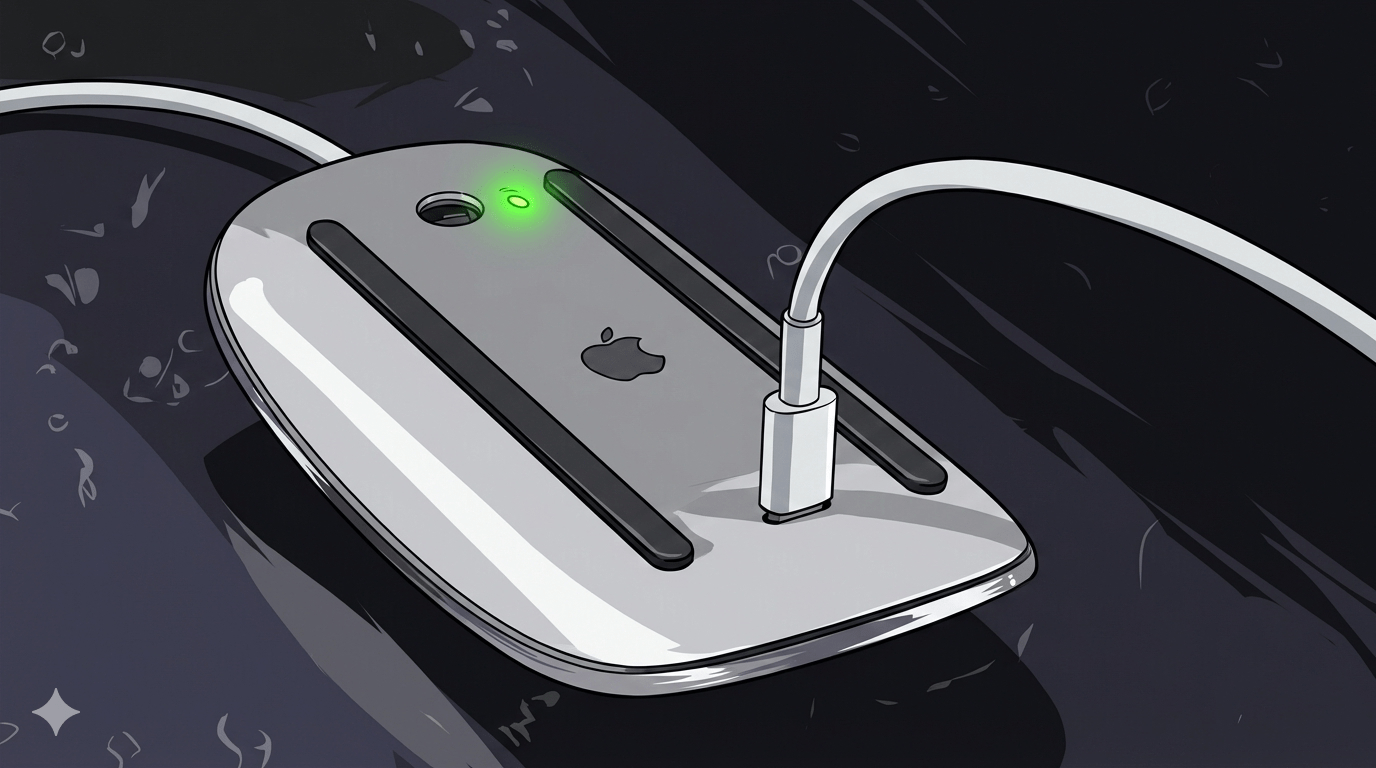
But then comes the behavioral level, the one of pleasure that derives from effective use and sense of control. And this is where the Magic Mouse fails miserably: when the battery runs out, you have to flip it over and insert the Lightning cable into the bottom, making it completely unusable while charging. In that moment, all the visceral beauty vanishes in the face of practical frustration. It doesn’t matter how elegant it is if I can’t use it when I need it.
The reflective level is that of conscious thought, memory, and pride of ownership. And here the Magic Mouse becomes an ambiguous symbol: sure, it’s part of the Apple ecosystem, but every time you look at it on the table upside down like a dying insect, that design choice reminds you that someone prioritized visceral aesthetics over your user experience.
Excellent design must harmonize all three levels. A strong positive visceral response can fail if the behavior is frustrating. My moka pot, with its functional simplicity, demonstrates the opposite: it works perfectly on all three levels.
The Disease of Our Time: When Too Much Is Too Much
As a UI/UX designer, I observe every day a pathology that Norman defines as “featuritis”, the compulsive tendency to add superfluous features to a product. The most blatant example? My remote control, which flaunts 9 buttons dedicated to various streaming platforms: Netflix, Disney+, Prime Video, Apple TV+… Buttons that are almost entirely useless, considering I access those apps from the same menu. But the problem isn’t just the physical clutter: it’s that these platforms could fail any day now, making the button itself obsolete. They don’t make you think of something that will last. It’s ephemeral design, designed for the instant but not for memory.
The main risk of creeping featurism is that the disproportionate increase in functions ends up destroying the device’s comprehensibility, transforming a useful tool into a labyrinth of obscure commands. Often this phenomenon doesn’t arise from real user needs, but from competitive pressures between companies trying to outdo each other, a strategy that paradoxically makes all products identical and equally confused.
When an object’s complexity exceeds the user’s ability to form a clear conceptual model, design ceases to serve the human and forces them to adapt to the illogical demands of the machine. And this is exactly what happens with the online interfaces full of bugs, useless limitations, and zero attention to the user that I encounter daily in my work.

The Two Gulfs That Separate Intention from Action
At the heart of Norman’s philosophy lies the concept that design should not be a challenge to the intellect, but rather a bridge that allows the user to overcome two great “gulfs”: the Gulf of Execution, where we try to figure out how to make something work, and the Gulf of Evaluation, where we try to interpret what happened after our intervention.
Think about the moka pot: the Gulf of Execution is minimal because the parts fit together in only one possible way. The Gulf of Evaluation is equally transparent: you hear the gurgling, you see the coffee rising, you smell the aroma. Each phase clearly communicates what’s happening.
Now think about a poorly designed web interface: you click a button and nothing happens. Or worse, something happens but you don’t understand what. You’ve crossed the Gulf of Execution (you found the button), but you’re lost in the Gulf of Evaluation. No feedback, no signifier telling you if the action was successful.

Knowledge in the Head, Knowledge in the World
An often underestimated aspect is the distinction between the knowledge we store in our minds and that which resides in the surrounding world. Norman argues that good design reduces the load on our short-term memory, which is inherently limited, capable of holding only three to five items simultaneously and fragile, subject to being erased by the slightest distraction.
The fundamental task of the designer is therefore to externalize knowledge, to transform “knowledge in the head” into “knowledge in the world”. When a designer correctly positions “signifiers”, those perceptible signals that indicate where and how to act, they are allowing us to act without having to consult manuals or strain to remember complex procedures.
The intelligent use of physical constraints and forcing functions acts as an automatic corrector for memory lapses. The ATM that requires you to retrieve your card before dispensing cash is a perfect example: you can’t forget your card because the system forces you to take it back to get what you want.
What Norman Taught Me
If I had to give one piece of advice to designers today, it would be this: simple is better. Don’t think about what you can add, think about what is superfluous. We live in an era of “smart” everything, but intelligent doesn’t mean complicated. It means the object adapts to human biology, not the other way around. Beauty and functionality aren’t enemies; they’re two sides of the same coin. Beauty without function is decoration. Function without beauty is engineering. True design merges both until interaction becomes invisible and profoundly human. Every morning, as my moka pot gurgles on the stove, I’m reminded of how powerful an object is that needs no explanation. It simply works. And perhaps that’s Norman’s true legacy: not a set of rules, but a new way of seeing the world. After reading it, you notice the handles that lie, the buttons that don’t communicate, the interfaces that make you feel inadequate. But most importantly, you stop feeling stupid. And you start demanding more.
If you found this article insightful or have your own experiences to share, let’s continue the conversation!
👉 Join the discussion on LinkedIn or feel free to contact me by clicking the buttons below.