Redesigning a Medical Aesthetics Studio's Web Presence: A Case Study
Written By
Edoardo Francesco Liotta
How a 14-page service redesign, a custom design system, and a simplified booking flow took a Vienna-based cosmetics studio’s site from a 53 mobile performance score to 73 — and from 92 SEO to a perfect 100.
The Brief
Anna Kosmetik is a medical-aesthetic cosmetics studio in Vienna offering everything from HIFU facelifting and microneedling to laser hair removal and shellac manicures — 14 distinct treatments across three categories. The site runs on WordPress with Elementor and uses Amelia for appointment booking.
The existing service pages had grown organically over time: inconsistent layouts, no shared visual language, and a booking experience that asked customers to choose between near-identical buttons that all led to the same place. Page speed was suffering, especially on mobile, where a single image-heavy page was taking over 24 seconds to render its largest content.
The goal wasn’t a full rebuild — it was a systematic redesign of every service page, built on a shared foundation, without touching a single word of the studio’s existing treatment descriptions.
Constraint as a Design Principle
One rule shaped everything: **the text could not change.** Every clinical description, every contraindication list, every product detail had been written and approved by the studio. My job was structure, not copywriting — eyebrow labels, headings, and visual hierarchy could be added, but the substance stayed untouched.
That constraint turned out to be useful. It forced the design system to do all the work. If fourteen pages of dense, technical, German-language treatment copy were going to feel premium and consistent, the *framework* had to carry that weight — not clever rewriting.
Beyond these three, a smaller pattern repeated across treatment pages: some had seven or eight identical “Book Now” buttons stacked on one screen, one per price variant, all leading to the same destination. Once the booking widget actually worked, that redundancy became obvious — it was solved by consolidating pricing into clear tables with a single call to action per page.
Building a Shared System
The first real deliverable wasn’t a page — it was a small CSS/JS framework: typography rules (Bodoni Moda for editorial headings, Jost for body text), a gold-on-navy color language, and a set of reusable components:
– A split-layout pattern for text-plus-image sections, with a flip variant so alternating sections don’t feel monotonous
– An interactive before/after comparison slider for treatments like HIFU and carbon peeling
– A contraindications grid, used consistently across every medical treatment
– A structured price-list component that scales from two services to forty without breaking
Every new page after the first three or four took noticeably less time to build, because the components already existed and the formatting decisions had already been made. By the time we got to the ninth or tenth service page, the work was almost entirely about content placement, not design decisions.
Three Concrete Problems
Rather than a vague “modernization,” the work centered on three specific, verifiable issues.
1. A “Book Now” button that didn’t book anything
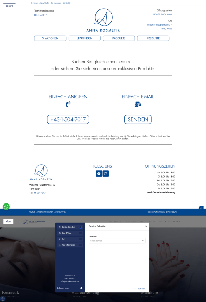
Every page had a prominent “Jetzt buchen” (Book Now) call to action. Clicking it didn’t open a booking flow — it linked to a page offering two options: call a phone number, or send an email describing when you’d like to come in. For a site built in 2024, that’s not a soft landing — it’s outsourcing the entire scheduling burden back onto the customer at the exact moment they were ready to convert.
The fix was integrating Amelia’s actual step-by-step booking widget directly into a modal on every page: service selection, date & time, cart, contact details — all inline, no phone call required.
2. A services page that disappeared on mobile
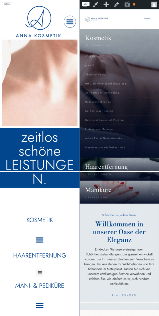
On desktop, the old “Leistungen” (Services) overview page was already minimal — three columns of plain underlined text links, no imagery, no hierarchy. But on mobile and tablet, it broke completely: the three category blocks collapsed into three titles, each followed by a hamburger icon that **did nothing when tapped.** No links, no images, no way to reach a single treatment page. For a local beauty studio, where a large share of traffic is someone searching from their phone, that’s not a styling issue — it’s an entire acquisition channel returning a dead end.
The rebuild keeps the same three-category structure but makes it actually responsive: full-width image panels with category names and treatment counts on desktop, gracefully stacking into tappable, fully linked panels on mobile.
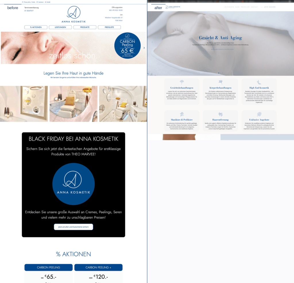
3. An aesthetic that undersold the brand
The homepage told the story on its own: boxed pill-style navigation buttons, a hero image with a sale bubble overlaid on it, a black “Black Friday” banner breaking the color palette, a grid of blue strikethrough-price boxes, and a blog-style “Neuheiten” card grid at the bottom. It read like an aggressive WordPress storefront from a decade ago, not a medical-aesthetics studio.
The redesign leaned on full-bleed editorial photography, a serif display typeface (Bodoni Moda) paired with a clean sans-serif body font, a navy-and-gold palette applied consistently, and soft icon cards replacing the discount-box grid. The same system carries through every one of the 14 treatment pages — visible most clearly on a page like Carbon Peeling, which went from a single column of static, unlabeled before/after photos to a proper hero, structured prose, three interactive before/after sliders, and a clean tabulated price list with discounted pricing shown transparently.
The Numbers
Here’s where it gets concrete. Lighthouse scores before and after, on the same representative page:
| Metric | Before | After |
|---|---|---|
| Performance | 75 | 97 |
| Accessibility | 90 | 92 |
| Best Practices | 96 | 100 |
| SEO | 92 | 100 |
| Largest Contentful Paint | 2.6s | 1.2s |
| Speed Index | 5.5s | 1.2s |
| Cumulative Layout Shift | 0.027 | 0.001 |
| Metric | Before | After |
|---|---|---|
| Performance | 53 | 73 |
| Best Practices | 96 | 100 |
| SEO | 92 | 100 |
| Largest Contentful Paint | 24.2s | 6.2s |
| Speed Index | 12.5s | 4.5s |
A 24-second Largest Contentful Paint on mobile is, frankly, not a page — it’s an abandonment funnel. Bringing that down to 6.2 seconds came mostly from disciplined image handling (correct aspect ratios, no oversized hero banners loading at full resolution) and removing redundant DOM weight from the old offer-card layouts.
The SEO jump from 92 to a perfect 100 wasn’t an accident either — it came from giving every single page (all 14 services plus general site pages) a deliberate focus keyphrase, a length-checked SEO title, and a meta description written for Vienna-specific local search intent, instead of relying on default WordPress/Elementor output.
What I’d Do Differently
Looking back, the price-list refactor should have happened *before* I built the first multi-offer-card layout, not after seven pages were already built that way. Establishing “one clear call to action per page” as a rule on day one would have saved a full pass of rework later.
Takeaway
Redesigning fourteen service pages without rewriting a single sentence of approved medical copy is a constraint worth embracing, not fighting. It pushes the real work into the system — typography, spacing, component logic, information hierarchy — instead of into prose. And the results show up where they matter: in Lighthouse scores, in a booking flow that doesn’t make customers choose between eight identical doors, and in a site that finally loads fast enough on mobile to keep someone around.
If you want to see the site live, go to Annakosmetik.net
View the UI details on Behance